Character · Honesty · Text · Colour · Surfaces · Shape & space · Symbols · Components · Placement · Motion · Words · Accessibility · Building a screen · Conflicts
Design System
The rules every Tideturn screen follows. They are read out of the app as it ships, not drawn first and built after, so where the code and this page disagree, the code is what users see and this page is the intent.
Tokens live in Tides/Helpers/: MagicValue.swift for sizes, Color+App.swift
for the few custom colours, AppButtonStyles.swift for button treatments. The sky palette is
SkyGradient, documented in Docs/sky-gradients.md. Where the app is inconsistent, the rule
here is the choice to build to, and the conflicts at the bottom say what is different today.
Orange boxes mark them in place.
Character
A tide app for people on boats and beaches, modelled on Apple Weather: a list of saved places, each a card in its own sky, tapping into one tall screen per place. Dark only, because the sky is the background and its lower half is dark at every hour. Calm, glanceable, honest. The number is the hero; everything under it is there to say whether to trust it.
Glanceable first
The height, which way it's going and the next turn read from the list without a tap.
Progressive disclosure
List, then the station, then a finger on the curve. Each step shows more.
Works with no signal
Every screen draws from what is on the phone. The network only makes it fresher.
Never invent a tide
The first rule, and the one that shapes the most screens. A plausible wrong number is the failure this app exists to avoid, so every state without a real answer looks like one.
.redacted(reason: .placeholder), never
0.0 (a real height) and never an em dash at 64 pt (reads as a rule). Lines with nothing to say keep their
height, blank, so the screen doesn't jump when the tide lands.wifi.slash and
"Offline — showing saved tides". The numbers stay; they are real, just not fresh.Text
System text styles, so text follows Dynamic Type. The one exception is the tide height, which is the reason the screen exists and is a fixed size. Samples are at the default text size.
| Role | Sample | Style | For |
|---|---|---|---|
| Hero height | 12.6ft | 64 pt SF Rounded thin, mono digits; unit 24 pt rounded regular, secondary | The tide now, on the station screen |
| Row height | 12.6 ft | 40 pt light; unit Callout medium, secondary | The tide now, on a list card |
| Screen title | Kitsilano | Title | The hero's station name |
| Card name | Kitsilano | Title 3, bold | A list card's name |
| Hero line | Falling Tide | Title 3, secondary | What the water is doing |
| Readout | 2.6 ft | Title 3, semibold, mono digits | The scrub readout over the curve |
| Row | Low 2.6 ft | Body | Table rows, panel values |
| Row label | Water temp | Body, secondary | The leading label of a panel row |
| Result | Honolulu Harbor | Headline | A search result's name, a sheet's lead |
| Status | Low in 5 hrs, 40 mins | Subheadline, semibold | The next turn along a card's bottom |
| Detail | 2.3 ft low at 03:10 | Subheadline, secondary | Second lines, result subtitles |
| Caption | My Location | Footnote, semibold | The line under a card's name |
| Panel heading | Today · Wed, Sep 30 | Caption, semibold, uppercase, secondary, with its symbol | The heading of a glass panel. The only uppercase text |
| Row caption | feels like 66° | Caption, secondary | Context under a panel value |
| Footer | ¹ NOAA National Data Buoy Center · Buoy 46088 · 17 km SE | Caption 2, secondary | Provenance under a card, outside the glass |
| Curve label | 20:02 14.0 | Caption 2 semibold time; 9 pt height, 70% | Turn labels on a card's curve |
.monospacedDigit() so they don't jitter as they tick. Prose never does..textCase(.uppercase) by
SectionPanel; the source string stays in normal case..lineLimit(1) with a
minimumScaleFactor of 0.7–0.8, so a long station name shrinks before it wraps a fixed-height card..alignedToCapHeight(of:), not on their frames..secondary. On a sky
card, where the type is forced white, the same job is white at 70%.PanelValueRow (body label,
mono value, plain caption), the Location panel's hand-made row (mono caption, plain value), and Solar and Lunar's stat
cells (caption label over a subheadline value).
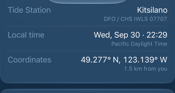
PanelValueRow for rows; the stat cell as a
named component for grids of four.Colour
Almost everything is a system colour on a sky. The custom colours are the tide, the sun and moon, and the scales an authority publishes. Nothing is coloured for decoration.
Chrome
The tide
The curve has to read over a sky that runs from noon blue to near-black, and no system colour survives both ends at
a 3-point stroke. These are in Color+App.swift.
Sun and moon
Levels and bands
The almanac family's level colours, the same on swimq and tideq's sites, and the bands an authority publishes.
.orange on the list card and widget,
levelWarning on the accuracy bar. Build to: .orange for app status, the level colours only
inside a scale.solarDay on the Solar arc but system .yellow for
sunrise and sunset on the tide curve; system .yellow also marks buoys on the map. Build to:
solarDay for the sun everywhere.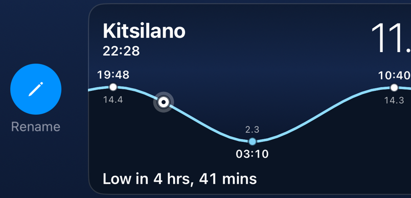
Surfaces
Four, from back to front. There are no opaque grouped lists and no materials: the sky has to show through.
Sky
The four-stop gradient behind every screen, pinned to the screen rather than the content. Its colours come from the time at the station and, on the station screen, the weather. See Sky.
Ground
The dark navy under the tide curve, which keeps going behind every panel to the bottom of the scroll. It follows the sky's time of day, not its weather: the water under a rain cloud is still the water.
Glass panel · SectionPanel
Every card on the station screen and in search results.
Regular .glassEffect, radius 16, 16 inside. Not interactive.
Sky card · StationRowView
A list card is not glass: it is its own station's sky, clipped to 16 with a 1 pt white 15% hairline, so cards in different time zones are different hours on one screen.
PanelLinkButton is regular glass,
interactive, full width: the way to a sheet or an alert among cards that are only read..clear glass, which lenses the sky instead of frosting it.UnavailableFavoriteRow) is the app's
only .ultraThinMaterial and its only radius 20, in a list of sky cards at 16. Build to: the sky card's
shape and edge.Shape & space
MagicValue.panelCornerRadius, shared by glass panels, list cards and link
buttons so they read as one kind of surface. Floating things are capsules or circles. A picture inside a card (the buoy
camera) uses half, 8.Spacing
SwiftUI's defaults, named. Anything that is plain .padding() stays plain.
Sizes
| Token | Points | For |
|---|---|---|
heroExpandedHeight · heroCompactHeight | 150 · 100 | The hero, at rest and scrolled under |
chartHeight | 220 | The station curve; its top 64 is the scrub readout's band, reserved at rest |
| Card graph | 128 | The curve on a list card |
stationMiniMapHeight | 180 | The map on the station screen |
solarArcHeight | 76 | The sun's arc |
| Circular button | 44 | Nothing tappable is smaller |
dimOpacity · veryDimOpacity | 50% · 15% | Past and off; hairlines |
MagicValue, shared by card and widget.Symbols
SF Symbols only. A panel heading's symbol is the panel's subject at a glance. One symbol per idea:
| Idea | SF Symbol | Idea | SF Symbol |
|---|---|---|---|
| Tide table | calendar | Tide station | water.waves |
| Solar | sun.max | No tide station near | water.waves.slash |
| Lunar | moon | Place | mappin |
| Atmosphere | the reported sky, else cloud.sun | Location panel | mappin.and.ellipse |
| Water | water.waves | Swimming, a beach | figure.open.water.swim |
| Accuracy | checkmark.seal | How heights are measured | questionmark.circle.fill |
| Rising · falling · slack | arrow.up.circle.fill · arrow.down.circle.fill · minus.circle.fill | At high · at low | arrow.up.to.line.circle.fill · arrow.down.to.line.circle.fill |
| Offline, saved tides | wifi.slash | Failed, nothing to show | exclamationmark.triangle |
| Map | map | Settings | gear |
| Add | plus | Rename · Remove | pencil · trash |
| Leaves the app | arrow.up.forward | Zoom to fit | arrow.up.left.and.down.right.magnifyingglass |
water.waves means five things: the Water panel, tide stations in search,
"No Stations Yet", the widget's placeholder and a place's station marker. Data Sources links out with
chevron.forward where everything else uses arrow.up.forward. Build to:
water.waves for a tide station and the app's empty state; give the Water panel its own
(thermometer.and.liquid.waves); arrow.up.forward for every link out.Components
Build screens from these. A new one gets a row here before it is used twice.
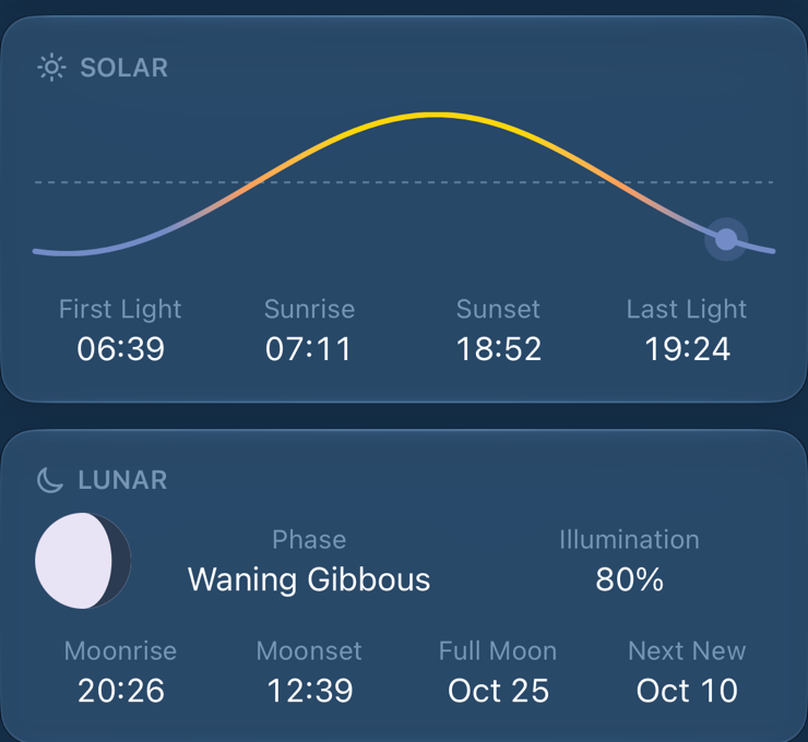
SectionPanel
A glass card with an optional uppercase heading and symbol. Every section of the
station screen and of search results. Rows inside are separated by Divider().
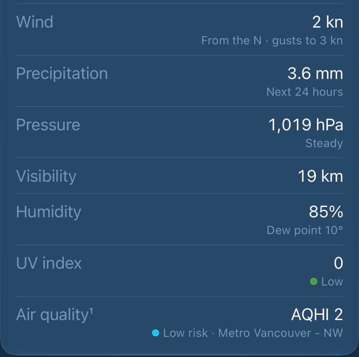
PanelValueRow · PanelRow
Label leading in secondary, value trailing in mono digits,
an optional caption under the value, an optional band swatch on the caption. A panel builds its PanelRow
values first and draws only the ones that exist, so a missing reading takes its row and its divider with it.

PanelFooter · SourceAttributionView
Provenance under a card, outside it, inset to the
card's text margin. One line per source, the upstream's own credit first, numbered with superscripts that match the rows
(Format.footnote).
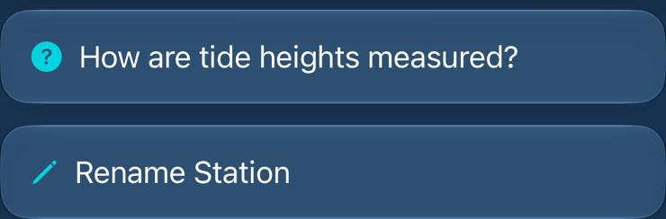
PanelLinkButton
A glass button the width of a panel, under the panel it is about. Tinted symbol, no chevron: it opens a sheet or an alert, it doesn't push.
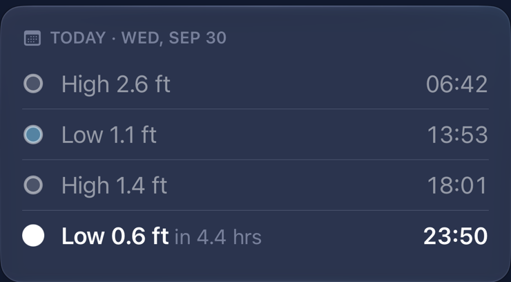
TideExtremesTableView
The day's turns in order. Past turns at 50%. The next turn semibold with a solid white dot and its countdown, quieter, inline, so every day's table is the same height.
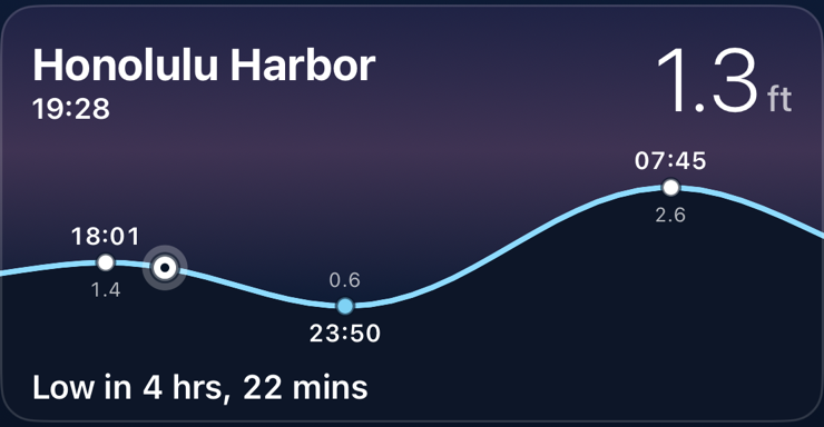
StationRowView
A list card: the station's sky, its curve around now with the turns labelled, the bead where the water is. Name over its clock (or "My Location"), height top trailing, the next turn counting down along the bottom. The trailing end of that line is kept free for conditions. The widget's face, iterated here first.
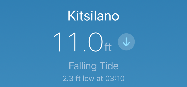
StationHeroView
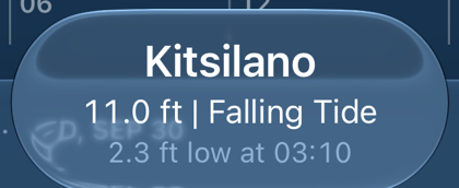
Pinned over the scroll, always about now. Expanded: name, height with the direction glyph, what the water is doing, the next turn. Scrolled under: a clear-glass capsule with the name over "12.6 ft | Falling Tide".
TideChartView · TideGraphView
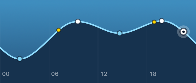
The day's curve, full bleed, drawn by hand. Turns as dots, sunrise and sunset on the line, hours every six. A drag pages days; a hold then drag scrubs, with the readout in a band reserved at rest so the curve never jumps under a finger. The y-axis spans the whole fetched window, so a neap day looks smaller than a spring one.
PlaceResultRowView · SearchResultRowView
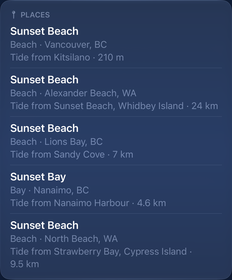
Headline name; subheadline secondary lines. A place says what and where, then whose tide: "Tide from Kitsilano · 290 m". A station says region, source and distance. Places first, then stations, each in its own panel.
AccuracyRatingPanelView · AccuracyRatingBar
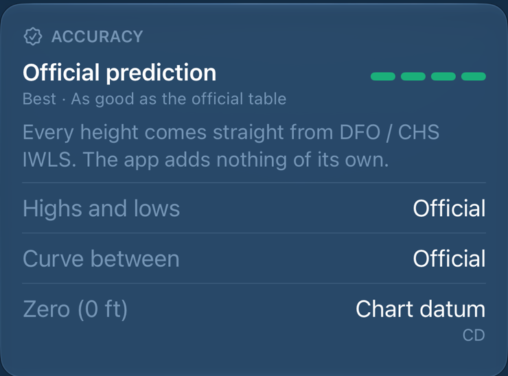
A headline verdict, a four-step bar in the level colours, a sentence saying where the heights come from, then rows. Last on the screen, because the reader who scrolls that far is asking exactly this.
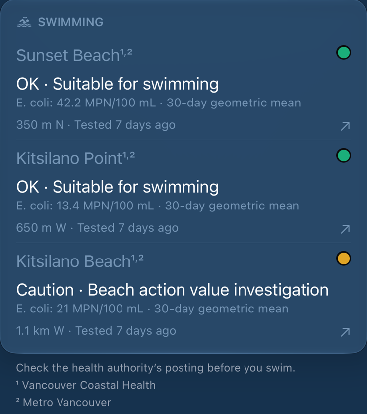
SwimPanelView
One beach per row: its name (secondary, with footnote marks), the authority's verdict in its own words, the reading, distance and age, and swimq's dot tying the row to its pin on the map. The footer names each authority.
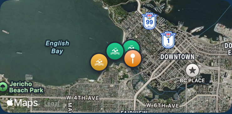
StationMapPanelView
Not in a card: a map is already a framed picture. The station, its buoys as yellow pins numbered like the Water footnotes, and its beaches. It takes no gestures, so it can't fight the scroll; a tap opens the full map.
ConditionSwatch
A band dot beside a caption, sized from the caption's cap height so it stays right under Dynamic Type. Or, on the Swimming card, swimq's own beach dot: solid for the authority's verdict, a ring for a guideline one.
.circularClearGlass (only in its preview) and
.dayPill/DayPillsView (off the screen for now). Hand-rolled copies of components: the Location
panel's rows, Solar and Lunar's identical stat cells, the buoy camera's footer, three glass capsules with different padding,
and the now-bead drawn three times at three sizes. Build to: the component, or a new one listed here.Placement & navigation
No tab bar
One list at the root. Search and Map in the bottom bar, Settings top trailing.
Stations are a cover
A tap zooms the card into a full-screen pager; swipe between favorites, pull down to go back to the card it came from.
Maps are covers
A map and a sheet fight over the same drag, so every map is full screen.
Look before you add
A search result or a map tap opens a preview sheet with the real tide and Add in its toolbar. Nothing is saved by a tap.
Order on the station screen
Hero, curve, then the day (table, Solar, Lunar), then now (Atmosphere, Water, Swimming), then where (map, Location), then trust (Accuracy, How heights are measured, Rename).
Typing in an alert or a field
Rename is an alert. A pressed place's name is an editable field in its sheet's title.
Motion
Follow the finger, fade the rest
Things the finger moves settle with .snappy(duration: 0.28).
Things that change because of it, like the panels for a new day, fade with .easeInOut over the same 0.28 s.
Sky changes blend over 0.4 s, weather over 1 s. The list's sky is never animated: it should already be there.
The sky is the only thing that moves on its own
Rain, snow, fog, stars and lightning, at 30 fps, and only on the screen in front. Reduce Motion or Low Power Mode stops all of it.
Words
Case
Title Case for buttons, titles, empty states and picker names ("Rename Station", "Try Again",
"No Stations Yet"). Sentence case for row labels and footers ("Water temp", "Local time"). Panel headings are written in
normal case and uppercased by SectionPanel.
Separators
MagicValue.middleDotSeparator " · " between facts. " | " only in the compact
hero, Weather's "18° | Cloudy". An em dash only in sentences.
Say the next thing
"High in 2 hours, 24 mins", not an arrow: "High in" already says which way the water is going. "2.3 ft low at 03:10". "Tide from Kitsilano · 290 m SE".
Same thing, same word
Station (or tide station), place, favorite, turn, high, low, Remove. A value
formatted somewhere already is formatted the same way everywhere, through Format.
tides:// link, and "onNAV Tides" in Docs/product-design.md.
Build to: Tideturn for anything a person reads.Accessibility
- Text uses text styles and scales with Dynamic Type, except the tide height. Fixed-height cards rely on one line and a scale factor.
- Panel headings are headers. Each row is one combined element, read label then value.
- Every drawing (curve, arc, moon, ruler, map) has one label that says what it shows, and its parts are hidden.
- Swatches are hidden; the band's name beside them is what is read.
- Lightning stays under the three-flashes-a-second limit: two pulses at 22% white about every 13 s.
Building a screen
For agents. Before writing a view:
- Put it on a sky. A new screen draws
SkyGradientbehind it, or publishes aSkyPreferenceif it sits inside a pager or sheet that draws the sky. - Group content in
SectionPanels, not aListorForm, unless it is Settings-style system UI. - Rows are
PanelValueRows built fromPanelRowvalues. Footers arePanelFooter. - Every displayed value goes through
Format, every layout number throughMagicValue, every custom colour throughColor+App. No literal in a view body. - Decide what each empty, loading, stale and failed state looks like before the happy one. See Never invent a tide.
- Side effects go in an Operation; the view only fires it. The architecture is in
Docs/data-flow.md. - Add a scenario to
Design/screens.ymland the screen to Screens.
VStack(spacing: 10) {
    Text("WATER").font(.caption.bold())
    Text("\(temp)°C")
}
.padding(14)
.background(.ultraThinMaterial,
in: .rect(cornerRadius: 20))SectionPanel("Water",
systemImage: "water.waves") {
PanelValueRow(
label: "Water temp",
value: Format.temperature(temp,
unit: temperatureUnit))
}Conflicts, all together
Where the app disagrees with itself today. Each is marked in place above with the choice to build to. None is fixed yet; a PR that fixes one takes it off this list.
- Tide height in three typefaces and weights; unit in two greys.
- Label-and-value rows styled three ways.
- Two warning oranges; two sun yellows, and yellow also means buoy.
- Rename blue and teal; station markers blue and teal.
- The unknown-favorite card: material and radius 20 among sky cards at 16.
- Literal spacing and opacities, and the card and widget drifting apart.
water.wavesfor five ideas; two link-out symbols.- Unused and duplicated components.
- Reduce Motion checked only by the sky.
- The app's name four ways.
- Offline, Remove, metres, and label case each worded two ways.
- Settings' footer describing a list card that changed.
- Sheets close four ways: Settings and Data Sources with a checkmark (
.confirm), the datum sheet with.close, maps and previews with.cancel. Build to:.closefor a sheet that only shows things,.cancelbeside a button that saves. - Search writes a region two ways: "US-HI · NOAA" for a station, "Honolulu, HI" for a place, and keeps an authority's capitals ("HONOLULU"). Build to: one region style; names as the authority spells them is a data question.
- Docs that have fallen behind the app:
Docs/sky-gradients.mdsays the station screen has no glass cards yet;Docs/product-design.mdcalls the app "onNAV Tides", puts a gear on the station screen (it has Share, the page dots and Station list along the bottom) and lists Share as not built.
Tideturn • Send Feedback • © 2026 Gerry Shaw